
 |


I do a lot of embossing on my projects for texture. I always use a pigment pad for the ink because it is nice and juicy. My black just isn't that way so I always use my purple under the black embossing powder because it doesn't show anyways, but gets really great coverage. These are just really cheap craft store inks nothing super fancy. I heated the embossing in on stamps both on the back cover which is the umbrella man Tim Holtz stamp and on the front cover which is my Harlequin diamond stamp also TH.

Just as a side note and tip about embossing on a cardboard cover journal. It is not so sturdy that it won't bend. The stamp on the front warped the cover slightly from the heat of the embossing gun but it doesn't bother me at all. The other part of that is the fact that the Dylusions journal has an envelope on the inside cover which is attached with adhesive. By heating up the cover it warms the glue from the envelope and causes it to come off of the cover. Since I only heated the corner it only peeled away slightly. The rest stayed securely attached, and I just added glue under the corner and re-glued it. Easy Peasy.

Moving along I used the Tim Holtz, (who I will now just reference as TH) stencil of clocks. I made both a positive and negative pattern with that stencil on both the spine and the side front cover. I smeared some purple and blue acrylic liquitex heavy body acrylic together and smeared in different places. I like to add the same color in a couple places to tie them together. I used a glitter copper color that smears to be quite transparent over the tissue text to add a little shine.
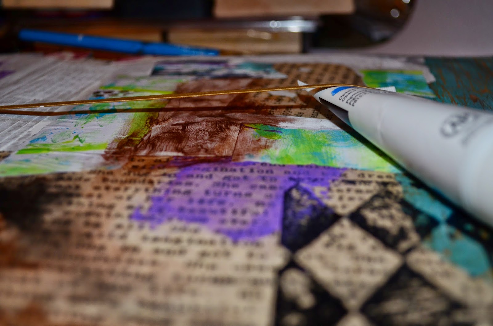
At this point there are pieces of under paper glued to the cover to add different colors. What I am showing with the paint here is holding up the elastic so the paint underneath can dry without getting color on the elastic band.

I LOVE LOVE LOVE texture...SO 3 colors of blue acrylics and modeling paste..that tubes was about $8 but it is lasting FOREVER!!
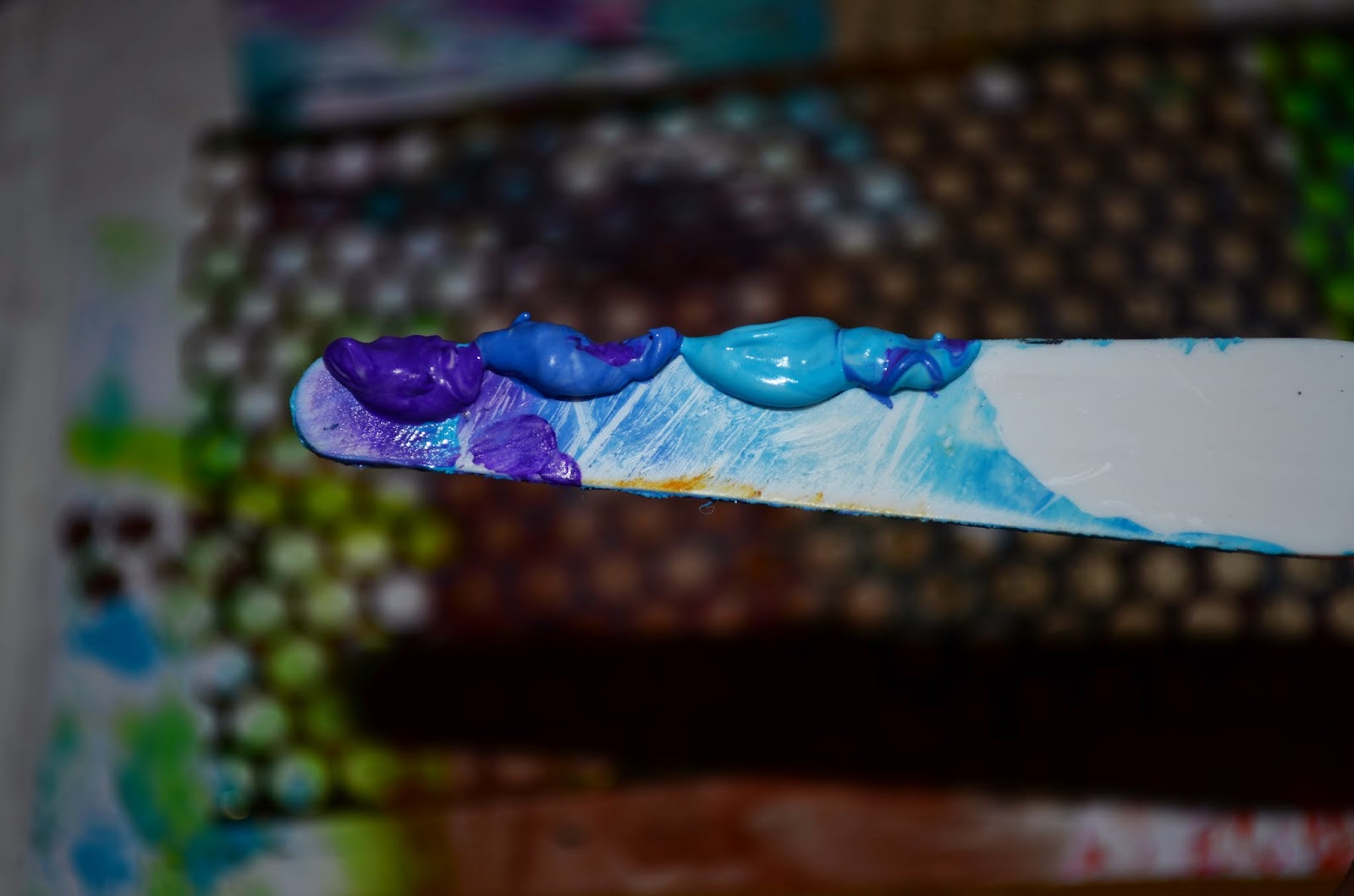
I scraped the colors onto a palette knife so that the appear variegated.

Punchinella!!!

I placed the punchinella on the cover and swiped my colored modeling past over it so that I have this progression of color and raised fun texture as well.

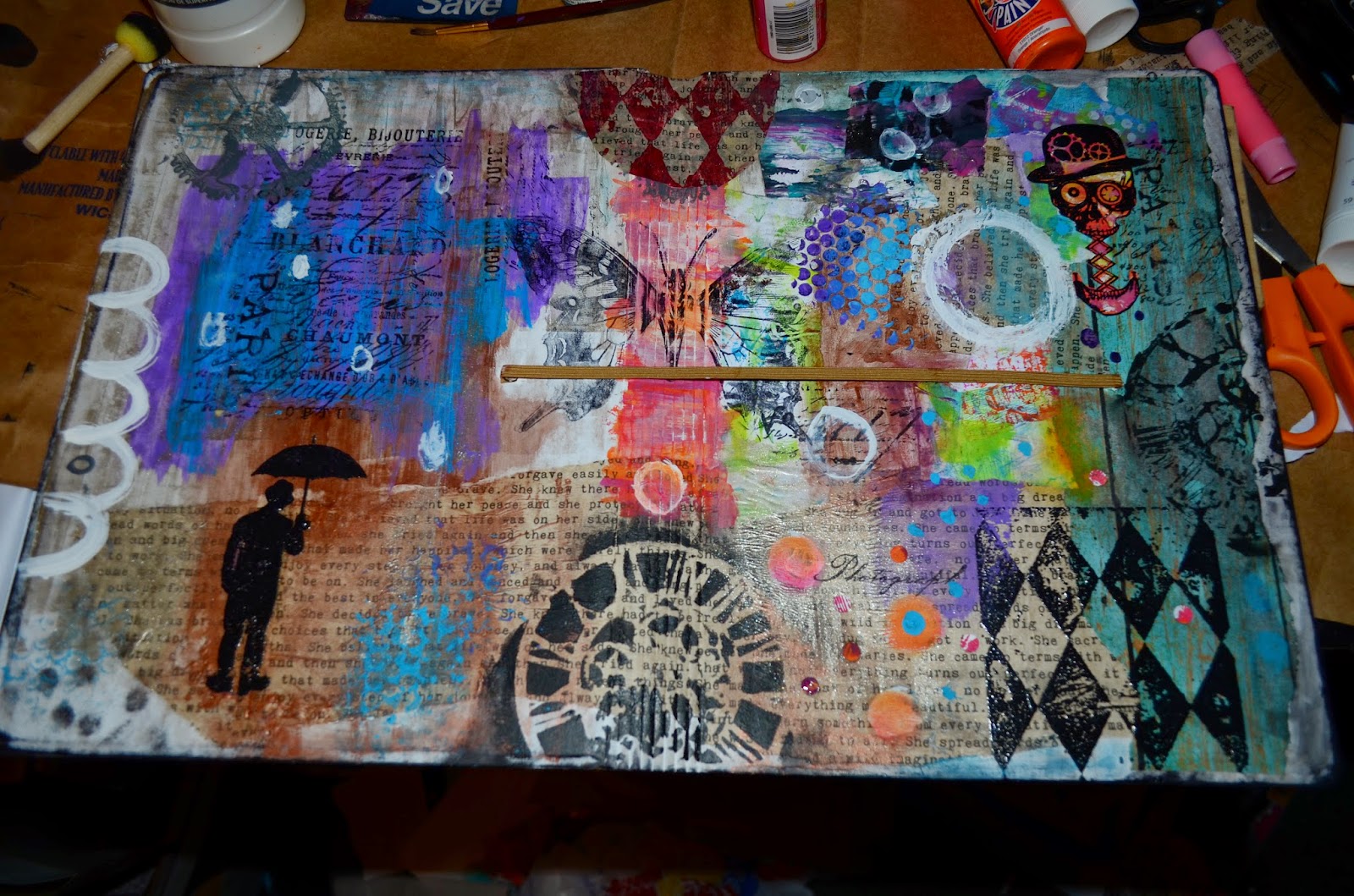
At this point I have added white circles with white gesso and some borders and edging. I have a huge butterfly stamp that I picked up at a thrift store and stamped it across the spine. Originally I just left the rough print black ink, but eventually I did stamp over it and emboss it which gave it a better finished look. I added more doodling, tissue papers, gear stencils and under papers along with my Steampunk Skeleton stamp.

Mmmmmm...Gelatos! I love to use these as a blending color as well as to add shimmer. I used darker purples around the purples, and I used them on the dots on the right side. I also used a large hole punch to cut out the tiny dots which I glued to the page and outlined with black pen.
Almost done....

Adding more color. (Notice the glued down metal gear embellishments.

This is how my spine ended up looking

A side by side of the original work and journal cover interpretation.

Inside envelope: Mod Podged printed tissue paper I received in happy mail.

Done...I added more white doodles with a gel roll pen and the black and white circles were to harsh. They are now covered with a printed tissue paper and I LOVE them!
WEEK 1
Month Theme: The Blank Page and how to Face It.
Challenge: Book Paper
Journal Prompt: Be your own Goal Keeper
This was the very first 2015 DLP Journal Prompt. There are times in my creative art journey that I get stuck on or obsessed with a certain technique, style, tool, or color. The recent list goes something like this: tags, gelli plate, zetti art, book making and coptic stitch, and now Mandalas! I was inspired by one of my fellow journal friends to learn how to make these amazing designs. One thing about the art community is there is always something new to learn from others. If I find a style or thing I like, I figure out how to learn it..mostly pinterest and youtube tutorials. I don't want a reproduction, I want to learn and make it my own.
SO, the mandala. If you can draw and line with a rule and use a compass, you can make a mandala (If you can dodge a wrench, you can dodge a ball.) There are some designs so intricate and unique I couldn't imagine the depth of time and detail to make them, but for art journal purposes I have achieved a basic knowledge and ability to at least create them. The details can come later.


I decided my list would be randomly floating in the middle of the mandalas. This became what is the scroll in the middle of the page. Sort of a disconnect. I outlined all of my mandalas in the black ink pen and drew in the designs by random doodling. I learned that by hours of interesting zentangles and now hold onto my favorite patterns and use them often.

Before adding color, I put pieces of newspaper under each side so everything underneath would be protected. I am not oblivious to the fact that my completed cover Will get paint on it and every other kind of medium, but I will try to protect it for now as best I can.

I was going to paint the entire background black to make the colors of the mandalas pop....Suddenly I was seeing space and sky so I blended in the colors with black and some blues. Once they color was down I realized I had no place for my black ink to show up in the notes I wanted scrawled around the mandalas. Gesso to the rescue! lightly blended in but not outlined exactly.

Markers!!! I don't have copies, or fancy or anything..I have a very very old dried out set of stampin up that i force the color out of and some small crayolas, but the colors are the best! I traced the Tim Holtz clock stencil in the middle of the far left mandala..which is also on my cover..maybe it's a "thing" this year. The lines connecting the mandalas are white out pen with a little bit of dots here and there to make it less "perfect" because apparently white out pen seeps under the ruler edge :(...i'll cool with it.) I cut up small reminder phrases out of a book called "Girlfriends Guide to Getting your Groove Back" by Vicki Iovine. Such perfect wording and things for this goals list. Lots of glue later, so outlining with black pen and my layout is complete.

My word for the year, as some people choose, is Connect. It just came to me one day in my attempts to make better connections with people and things in my life. Connecting to my art in a way that even though I may use a prompt the idea and work is a connection to what is important to me. Connection to my family and being the more active mom and wife I was lost finding a year ago. Connection to friends and community and to nature. This page surprised me and raised my personal bar for what I could accomplish with this journal. I appreciate a good personal growth challenge.
Since I focused so heavily on mandalas and not the book pages I had a few empty pages at the beginning of my journal for a table of contents or a write up about my goals and journey this year.

I pushed myself to "follow directions". After watching all of the Art to the 5th videos, I found myself wanting to try some things I had seen. During my latest (weekly) art room reorganization, I found a shoebox with happy mail I had stored in the closet. Tara! NEW papers to use. Dylusion inked book pages, stamped face on a book page, stamps of useful quotes, printed tissue paper, ledger paper, blank music writing paper, napkins and colors. So I played with laying them out and let the edges overhang. I liked cutting them down to the exact page to fit. I LOVED all the color.

...But then came gesso. I still love that the color showed through.

I scribbled some words and added a stamped image cut from card stock.

I am not a big fan of watercolors simply because I don't have the patience to figure out how to paint realistic things with them. HOWEVER, I did follow Roben Marie's watercolor on gesso tutorial and I LOVE how this turned out. My son actually bought me an "art kit"..watercolor pencils, watercolor tubes, and cakes for Christmas..I used them..they are no Derwent intense, but it was fun to use them just the same.

This is the 2nd page of my journal. I added some little paint spots here and there. In organizing I found a tin of Month Stamps I've had and never used and stamped them six down each side and will write in the monthly theme, journal prompt, and challenge each week and it will be fabulous at the end of the year. I would NEVER have made a page like this on my own...If I haven't already said..I LOVE how it turned out and it's all my own original inspired by others ideas work.
Week 2
Month Theme: The Blank Page and how to Face It.Art Challenge: Gesso
Journal Prompt: "The beginning is always today" M. Shelley

Gesso...I started with the plain white when I first learned about gesso..then I heard there were different kinds...Wait what?!?! Different kinds of gesso..no way. YES way! The big large tub of black gesso above is from of course Dick Blick. The size of this tub is both a good and bad thing. It IS a significant amount of gesso AND you can dip the long edge of a credit/scrape card in it without having to dump any out. Unfortunately it's all bad news after that. I can barely fit my hand over the lid to open it and when you try to clean the lid or sides it's kind of like truck grease..the more you try to clean it up the more mess you make..but I digress. ..

This next little handy liquitex container also from Dick Blick, is lava medium. It has little black grains of sand or whatever and glitter in it. It dries clear so it leaves like a rough texture or sandy black spots. I LOVE it! I just added some to the sides over where I had scraped my black gesso with a dried out stiff brush, simply for the purpose of having every gesso I own on a page for the gesso challenge.
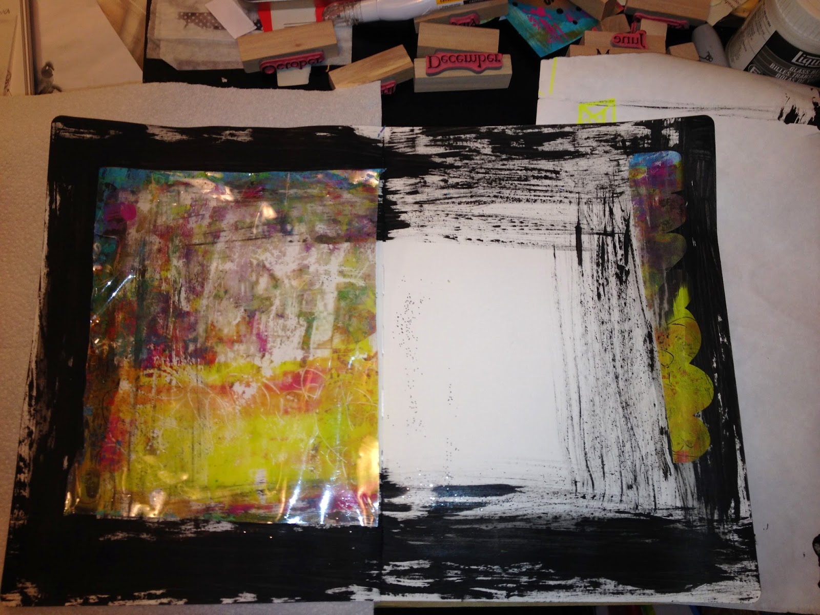
When I was into doing gelli plate tape transfers I did not actually own a gelli plate. I did have page protectors and this one has been lying around with fantastic color for months. I clear mod podged over the painted side so I could cut it and have it be the inside of a window pocket...Instead it ended up glued to this page. I used clear gesso over the page protector so I could add more to the shiny surface...I heat dried it and it crinkled...(extra points for texture). I also cut a border and added it to the right side of the page.

White gesso with a texture tool on the left and splattered blue paint on the right.

MORE gesso!! Butterflies. The beginning is always today symbolic of butterflies and a chrysalis..a new beginning. I have had this paper up on my bulletin board for a long time and decided it was time to use it. I cut out individual butterflies firs and then a big group of them. I cut around the specific wings to make them appear more real and floating from the page. When I laid them out where I wanted them to go, I traced the butterflies with a pen. I painted black gesso under them. First I thought it was just a good outline, but then they kind of felt as if they were flying out from a hole in the page.

Here is the large cut out piece so you see the shadow effect of the black gesso.

I painted the gesso on with a paint brush out past the traced line. This time I did not fill in the whole area because I realized it would be a waste and covered with the butterfly paper.

Here is a quick gluing and placement trick I like. I put the large cut out piece face down on a sheet protector and glued all the way around so I could get all the edges very well secure.

When you flip the protector over holding the butterflies to it you can see where you want to place them on the paper.

It also allows to roll over the whole image with a brayer without glue smudging out of the edges.

Pull up the page protector... Image placed where I wanted it. Happy journal here.

Like I said I enjoyed the black being just left black but I wanted to incorporate the quote into the black line under the butterflies on the right. Then I just felt really scribbly and randomly scribbled all of the black gesso edges. Again with the Tim Holtz clock..I'm telling you I don't know what it is about that stencil. Today=time=clock..I traced the stencil. I don't like to ink it because the ink doesn't transfer well. I don't like to paint stamp it because the paint smooches out underneath..soooo I trace it with a pencil and this time I painted it with black gesso. To make the lines imperfect I added the white gel pen scribbles to out line it. I found the sparkly swirl sticker in happy mail and used it to give the butterfly motion.

I love the depth the butterfly paper gives the page.

A few letter stickers and black outlining are added and I may add some journaling later. I am really into bright, vivid, expressive colors. I just let myself play with gesso with no regard to what I expected it to be...It's different and I step back and think..hmmm. I made that. It is sooo freeing to create organically and just used what is on hand. Plus I love butterflies. :)
***REVISION***
I made the 2 sides more cohesive and added some text from a hallmark bag..now I LOVE it.

Week 3
Month Theme: The Blank Page and how to Face It.Art Challenge: The Color Wheel
Journal Prompt: "I found I could say things with shape and color that I couldn't say any other way"-Georgia O'Keefe
I have to say I am loving having an art challenge AND a Journal prompt. Not just an idea journal prompt but a quote that makes me think about the quote itself in life and also how I can apply it to the challenge. I really grabbed hold of the idea of honoring Georgia O'Keefe. There are still a lack of women artists recognized in history and now for accomplished art. I have taught O'Keefe lessons to preschool and elementary kids and they have a great time, so having a little background knowledge of the artist, I wanted to tie in my color wheel to her art. I love 1927 Poppies. I'm not a flower girl for art generally, BUT I can grasp and abstract idea and run with it on my own. I decided to make a color wheel, or rather "color field" of poppies. Each poppy on the left hand side is a color of gelato and the name is scribbled in one of the petals. On the right are my Intense block colors. I don't love the end as a wow this is a fantastic art piece, but I love it for it's rawness and sketching effects. For me that is all it takes.

Week 4
Month Theme: The Blank Page and how to Face It.Art Challenge: Writing
Journal Prompt: Words with Friends
Hello White Space!! Where have you been my whole life. I REALLY struggle to leave things blank, but I can't think of anything else to add to this page. Words with friends ..a list of words that mean "friend" or traits you have or seek in a friend. I LOVED this challenge. This is what happens to my art when my art room is clean :)

Week 5
Month Theme: The Blank Page and How to Face it.
Art Challenge: Underpaper
Journal Prompt: What Lies Beneath
I had these two large pieces of underpaper on my bulletin board as art because I love them so much. I cut each down to fit a side of my layout this week. I didn't want to cover up the color so I'm doodling and writing aside from the cut circles.

Week 7
Month Theme: Layers you will Love.
Art Challenge: Cover up the good Stuff
Journal Prompt: What Lies Beneath

This page started out as an attempt at white space. If you don't remember for other posts, I attempted a gothic dark castle of a thing for a previous challenge and absolutely did not like it at all. I covered up so much work and space that it looked like a completely different project at the end of it all. Since I had covered that up, I wasn't ready to jump in and cover up more. SO I started with a large butterfly stamp from a thrift store and some plain textured backgrounds. Circles are very zen to create and relaxing so the page took on a few of those. I like the bright colors this time but they are not my "usual" palette.
Some Tim Holtz stencils, and bright paints and I was done...or so I thought. During the week I completed backgrounds for an imagination project with students at school using the salt lifting technique. Just as amazed as the kids, I went right home and added some of that texture to this page. I love texture, so I added the music paper and washi tape. I don't think I will add much else.
Week 6
Month Theme: Layers you will Love
Art Challenge: When not to stop
Journal Prompt: Don't stop till you get enough

Background of ATC's I would almost put these in a frame together as a collective art piece.


Washi Tapes and White Doodles
All of the layers together.
Week 8
Month Theme: Layers you will love.
Art Challenge: Repeating Elements
Journal Prompt: It's worth Repeating
This is kind of in the color scheme of my previous weeks. I have been heavily drawn to blue and purples lately. I tore some under paper for the backgrounds. I have a giant canson marker paper tablet I found on clearance, and then I found another..And promptly purchased it. The thinness of the paper allows it to be a background fairly easy and is easy to work with. I just ripped this page in half and sewed my repeated elements blocks them. Add washi tape, some repeated musical notation and newly discovered zig zag and each element on the page not including the background has a repeat somewhere on the page. Orange and white circles, washi tapes, white scalloped borders, and salt lift technique paper. I LOVED this process. I was don't with it and didn't want to add more, but something just kept inviting me to keep going.

I softened up a lot of the bright colors with white gesso and used bubble wrap prints in a bright complimentary color to pop some interest on the page. I circled those up with some bright turquoise and green scallops. I used Dylusions Spray ink in the middle and the two bright puddles on either side between elements. I liked how it looked when it was drying and I still like it but it's not as defined as its seeped into the page. Also it went through the middle spine to other pages. My biggest "issue" with this journal so far.

Week 9
Month Theme:
Art Challenge: Using at least 5 layers
Journal Prompt: Give me a hi 5
Didn't know where I was going with 5 layers because my original base was only 3 and I didn't want to cloud it with more. It was perfect as is. I grabbed a happy mail envelope with a clown stamp and made a sewn book with color swatches..Those are my 5 layers. Since my life has been crazy busy the circus theme was perfect. Ephemera printed vintage circus Elements are courtesy of Amber Button of CraftyButtonDesigns.
Vintage March 1972 National Geographic featuring Circus life was the page I copied for my background image.
Week 10
Month Theme: Making Your Mark (doodling and marking making)
Art Challenge: As a layer element
Journal Prompt: Surviving the elements
I stopped reading the challenge after the word doodle. I kind of missed the surviving the elements, but I did use the background of this page as my doodle element. I survived it in essence because I had no idea where it was going and survived the clear gesso and moving forward. To each his own interpretation.

Enjoy noticing what cereal my family eats while you see the first stage of this challenge :) Clear gesso does smear my non permanent pen but I didn't care. By putting clear gesso I kept my doodles and made a perfect surface for smearing color and seeing the detail all the way through.


This is just my first one paged challenge. I like to smear paint everywhere and not limit my space but this worked. I wrote the prompt of sorts around the edge as a doodle. Then I threw in some zentagles and feathers. I added the black spots with a circle stencil and thought they were too bold. I went back over with the same stencil in a shadowing fashion with iridescent medium as pictured below. Then the outlines came and the tiny dots. I could NOT stop with the dots they were just therapeutic at the time.


Week 11
Month theme: Making your mark (Doodles and Mark Making)
Art Challenge: Borders
Journal Prompt: "Borderline, feels like I'm going to lose my mind"
I wanted to make a border around the edge to start that was different from a scalloped or lined border. I tore the edges of a piece of paper and set them down as a mask on the page and filled in with paint from the tear to the edge. I wanted to used the black, which is a matte chalkboard paint and then I decided to mix into blended colors on the opposite side. After those dried I painted the cream color with a gloss paint which actually gives depth to the pages. I originally was going to have a whole down to the center of the page from all corners but ended up with this instead. I added different borders from white gel pen and doodles and stitches, to zen and scallops. I used some softer colors than I usually would but still with a pop. I custom made the butterfly on the left page. I stamped a page of harlequin diamonds and cut out tall skinny hearts from the pattern. This was followed by stamping of butterflies and cutting them in half on a bright contrasting color. I placed the wings on the back and glued them down. With a 3rd pop of color the zig zag stitch was added on top as an extra texture. I have them in small and large sizes and also made with angel wings.

I stopped reading the challenge after the word doodle. I kind of missed the surviving the elements, but I did use the background of this page as my doodle element. I survived it in essence because I had no idea where it was going and survived the clear gesso and moving forward. To each his own interpretation.
Enjoy noticing what cereal my family eats while you see the first stage of this challenge :) Clear gesso does smear my non permanent pen but I didn't care. By putting clear gesso I kept my doodles and made a perfect surface for smearing color and seeing the detail all the way through.
I started blending these colors together with just acrylic paint and loved it. Then add purple washi tape. I didn't know how to continue without covering everything and losing the doodle elements which I really liked.
This is just my first one paged challenge. I like to smear paint everywhere and not limit my space but this worked. I wrote the prompt of sorts around the edge as a doodle. Then I threw in some zentagles and feathers. I added the black spots with a circle stencil and thought they were too bold. I went back over with the same stencil in a shadowing fashion with iridescent medium as pictured below. Then the outlines came and the tiny dots. I could NOT stop with the dots they were just therapeutic at the time.
More color and pop of blue on the feathers, light blue small brush swipes, glitter paint and white jelly roll pen. Some more shiny medium over the top and I'm almost done. I added the sentiment and some Tim Holtz rub ons. I figured this page wanted to look like this because I had really no direction after my doodling. I posted online for suggestions and appreciate them all. I rarely if ever has for ideas, I can figure out on my own and I'm pretty stubborn this way, but I'm trying to be more vulnerable and get feedback as a positive when I'm stuck. SO here it is and i LOVED it. One page, not typical, fun and bright with some cool doodles. Perfect to me and DONE!
Month theme: Making your mark (Doodles and Mark Making)
Art Challenge: Borders
Journal Prompt: "Borderline, feels like I'm going to lose my mind"
I wanted to make a border around the edge to start that was different from a scalloped or lined border. I tore the edges of a piece of paper and set them down as a mask on the page and filled in with paint from the tear to the edge. I wanted to used the black, which is a matte chalkboard paint and then I decided to mix into blended colors on the opposite side. After those dried I painted the cream color with a gloss paint which actually gives depth to the pages. I originally was going to have a whole down to the center of the page from all corners but ended up with this instead. I added different borders from white gel pen and doodles and stitches, to zen and scallops. I used some softer colors than I usually would but still with a pop. I custom made the butterfly on the left page. I stamped a page of harlequin diamonds and cut out tall skinny hearts from the pattern. This was followed by stamping of butterflies and cutting them in half on a bright contrasting color. I placed the wings on the back and glued them down. With a 3rd pop of color the zig zag stitch was added on top as an extra texture. I have them in small and large sizes and also made with angel wings.
Week 12
Month theme: Making your mark (Doodles and Mark Making)
Art Challenge: As a focal point
Journal Prompt: Coming into focus

Month theme: Making your mark (Doodles and Mark Making)
Art Challenge: As a focal point
Journal Prompt: Coming into focus
This week the picture speaks for itself. When I think of coming into focus, I think of photography and apertures, etc. I used this pertinent Mark Twain quote and created a bokeh effect with gelato and gesso.
Week 13
Month Theme: Making your Mark (Doodles and Mark Making)
Art Prompt: Create a Custom Element
Journal Prompt: "Ride the energy of your own unique spirit."- Gabrielle Roth
I ignored the journal prompt completely. Not intentionally, I had just created this custom stamp the week preaching the prompt and thought what a perfect element to use. Can't get much more custom than that.

Week 14
Art Theme: Watercolors
Journal Theme: "It's water under the bridge"

"Water under the bridge" screams Monet to me. I was going to use two different paint types to contrast the difference in paintings. The Starry Night at top would be acrylic and the Lilies pond and water would have been watercolor, but I got too involved in the painting and forgot to switch in between. So instead of watercolors, I have colored waters. I cut a bridge out of vinyl and placed it in the middle of my page as the tie between the two paintings. After the paint had dried I peeled off the bridge and I intend for now anyways, to leave it white. I thought it would be fun to try to paint on the turned pages of the journal, which was a struggle for me to break away from the "right" way. Of course there is no "right way". I look at it as a page of a book, maybe a children's book about art. "Once upon a Starry Night, Lilies glistened on the "water under the bridge".
Week 15 (wait what? where is this year going?)
Month Theme: Color Safari (Exploring Inks and Paints)
Art Theme: Acrylics
Journal Theme: "Cry me a River"

Water Under the Bridge, Cry me a River....po-tAto po-tahto.. water. Cry me a river is about crying. I had to draw something with a person or eyes. I did only use acrylics on the girl which was a huge stretch. Acrylics do not blend move and change like gelatos. Lots of blues, irridescent medium through a raindrop stencil as "rain"/"tears". So not all tears are sad and I wanted to convey happy tears through the colored tears. What I loved about this stencil with that medium is that when it dries it creates a "ghost" image of the drops. It has to have the right lighting to make the drops visible. I found so many quotes and things that I wanted to write so I wrote them in white gelli roll ink dropping down from individual raindrops. There are some pieces of under paper of the negative image of the raindrops that I ripped and sewed down. You can run the edges of the journal through a sewing machine as I did you just have to hold the book open from one side hanging down so that the page you are sewing on is perpendicular to the actual journal reaching into the foot of the machine. Texture became a huge part in the creation of this page for me. I also enjoyed drawing the zen doodlish waves at the bottom of the left page. This one feels very connected to me which is my "one word" for the year.
Week 16
Month Theme: Color Safari
Art Challenge: Gelli Plate
Journal Challenge: What's on your plate/Alot on my plate

I've had my Gelli plate since October 2015 from Dick Blick as part of my birthday purchases. Ive used it a few times but thing that it does the same thing as layering paints you put down on your own. I haven't really used it much and am not completely sold on it. In fact, the first layer I tried here I gessoed over because I just wasn't feeling the colors. I do like that I can get the look of the stencil as a stamp instead of a stencil..Example these feathers. I like the printed version over the sponged version and all the background colors. I will add words but for now I like it.
Week 17
Month Theme: Color Safari
Art Challenge: Inks
Journal Challenge: Before the ink is dry
Right before this prompt was given, I had purchased 2 new delusions spray inks in the lime green and a royal blue. I had also picked a 2 pack of stencils, one was the circle/bubble pattern you see here. The stencil I had used the night before to "try it out" and didn't want to have to wash off paint from drying so I tested the design with gelatos.
Well, what happened next was perfect. I sprayed the stencil with my two new inks creating the circles. I then smeared the top of the stencil with my hand to make sure the color got all over the section I was in, and the gelatos rubbed in the circles creating magical little bubble/circle metallic yumminess. I used a metallic blue and sea foam sort of green. I used the negative and positive images of the stencil and started adding more gelato when it was needed. The purple was pre gelatoed under papers with a Tim Holtz diamond stencil. I had just made the back ground and loved the colors but was going to walk away.
As I walked downstairs I was thinking geez, I know these inks stain I better wash my hands..but I noticed the cool flecked specks of metallic gelato and the yummy colors i had. How can you ink like this without getting it on your hands..that was my "lightbulb". Inks are about messy hands. I asked my husband to take a picture of my hands over my shoulder. I made them suitable for printing off my inkjet printer and then cut them out. I doodled over the cuffs of my grey hoodie, added some fun black borders and doodles, and then realized my butterflies had a place in this design.

The butterfly/wing hearts are an original Kim Lucas Designs creation. I use brightly colored card stock that compliments each other, and stamp a harlequin diamond pattern all over the page. Then I cut out a tall skinny heart that fits the size of the wings. I also make multiple stamped with black ink butterfly wings. I have some small and some large. I will also use angel wings as well. I cut the butterfly or wings in half and adhere them to the back of each side of the heart. I sew them around the edges of the heart using various colors and styles of stitches. Straight, zig zag, sloppy.. whatever style suits you. I have a collection of them and have sent out some in happy mail. I have never really incorporated them into my art or journals, but the inked hands lends the perfect "fly away" visual for the winged things.
This page feels really personal to me, and I loved having to jump off with no preconceived notion of what my page would be. It created itself magically, I was just the hands that were there. :)
Week 18
Month Theme: Touchy Feely (Texture)
Art Challenge: Fabric
Journal Prompt: The Fabric of Your Life

Week 19
Month Theme: Touchy Feely (Texture)
Art Challenge: Stitching
Journal Prompt: "All that I'm after is life full of laughter." Daughtry

Week 20
Month Theme: Touchy Feely (Texture)
Art Challenge: Modeling Paste
Journal Prompt: Rising to the Occasion
Monthly Theme: Touchy Feely (Texture)
Art Challenge: Cheesecloth
Journal Prompt: Say Cheese
I did not have cheesecloth in the house at the time of the prompt, nor did I have a reason to do so. I left this prompt alone all week, then looked up faux cheesecloth in an attempt to replicate it. Instead I realized what it really looked like and achieved that look with a white gelli roll pen over my inktense block background. I only wrote "Say" because in a picture sometimes the eyes don't say "Cheese" at all. They have something else to project.

Week 22
Month Theme: Touchy Feely (Texture)
Art Challenge: Textured Paper
Journal Prompt: I'm so not feeling it!
Picasso Dog Page
Watercolor pencil over gesso: I'm so not feeling it, appropriately named is the dog.
I use this lesson in art docent classes. Every time you draw a new feature you turn the page. I used textured paper with the cut out hexagons and adhered papers underneath to create texture for the overall composition. Picasso dogs are not an art style of Picasso exactly. They are an interpretation for his love of dogs and having one in his life at all times, and cubism with bright colors.

Week 23
Month Theme: Travel Journaling
Art Challenge: Illustrative Art Journaling
Journal Prompt: Take me away
Take me away from all the traveling I do in my own mind in a day. Journaling gets that out and this brain is a map of all the places I end up. Craniometer and phrenology head print. Very intriguing scientific components.

Month Theme: Travel Journaling
Art Challenge: Recording Memories
Journal Prompt: Taking the road less traveled

Week 25
Month Theme: Travel Journaling
Art Challenge: Hometown Inspiration
Journal Prompt: There's no place like home

Week 26
Month Theme: Travel Journaling
Art Challenge: Pictures and words
Journaling Prompt:A picture is worth a thousand words
Art Challenge:

Week 30: Week
Week 30:
Week 32
Characters/If you're going to be weird be confident about it. This is my "weird" which isn't weird at all. This is who I appear on the outside to be on the left and what I feel like inside and who I see is this girl in the mirror. I was going to clean it up but I like the rough look of it all. What is "weird" anyways..just because someone has a different like or opinion. hm.
WEEK 32

Week 31: Expressive Faces/What I see clearly Now These shadows were more expressive and thought evoking that any face. We took our 9 yo to his first concert "Imagine Dragons". The tour is "smoke and mirrors" and this was the image I caught through the stage curtain. Fragile represents myself and I see clearly what I need to do in my life to get where I want to be.

Week 30: Out of order "Real life/At this moment"

 |
| What would I say to my younger self |
 |
| Self Portrait |
 |
| How do I face challenges: Head on with my heart. Layers! |
 |
| Photo transfer from printer picture |


No comments:
Post a Comment
Thoughts and feedback welcome here!